Mobile Media SEO

What You Need To Know About Mobile Media SEO

mobile media seo

Find out the benefits of mobile SEO optimisation, how to optimise your website for mobile users, and where to get your mobile SEO checklist.

Pop quiz: What percent of the global internet population uses a mobile device to browse online?

A. 60%
B. 80%
C. 90%

The answer?

C.

That’s right: 90% of internet users used a mobile device to go online in 2020. And of that, 56.75% browsed with their phones.

It seemed like it wasn’t that long ago when mobile users only made up about half of all internet users.

And in reality, it wasn’t. In 2016, mobile users accounted for just 45.91% of online traffic. And in 2011, it was a mere 6.09%.

The surge in online mobile traffic makes sense when considering Google’s mobile SEO update, which it launched in 2015 and expanded in 2019 with
mobile-first indexing.

Before this change, mobile SEO had minimal impact on normal SEO. But now, Google prioritizes mobile-friendly sites, offering a significant advantage over those lacking a mobile version.

So what does this mean for you? Well, it means you need to make sure your website is mobile-friendly.

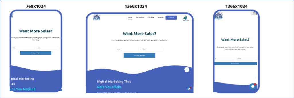
We’ve all stumbled upon a website that hasn’t been optimised for mobile devices. Generally, these sites are slow, hard to read, and a pain to navigate.

Not only that but do you really want information from a source that doesn’t even know to have a mobile-friendly site in 2021?

mobile media seo

An example of a website that is not mobile-friendly.

You don’t want that to happen to you, and neither do we. So if you’re ready, keep reading to learn the benefits of mobile media SEO, how to make a mobile-friendly site, and the best practices for mobile optimisation.

Benefits Of Mobile SEO Optimisation

Mobile media SEO entails having a responsive website and implementing standard SEO.

Responsive design is like bricks in the foundation of mobile-friendliness. While the cost of building a responsive website seems daunting, it’s worth the investment because it guarantees your site’s complete optimization.

And when your site is optimised from top to bottom, you’ll enjoy more benefits of mobile SEO optimisation over time.

Better User Experience

If your site’s user experience falls short, people will bounce in seconds – never to return.

But while the desktop version of your site provides a top-tier user experience, that doesn’t mean your mobile one will.

Think about it: Mobile screens are much smaller than desktop screens, so they have to cram a lot more in a fraction of the space. And that leads to problems with:

But with mobile media SEO and responsive web design, you can eliminate all
of those issues and make sure visitors have the best experience possible.

Faster Load Times

Phones, tablets, and other devices load mobile-friendly websites faster because the sites (including assets, text, code, images, etc.) are formatted specifically for these devices.

Inadequately optimised mobile sites typically have much slower load times.
The use of Flash elements can make this problem even worse.

You got places to go and people to see, and so do your visitors. When you need information on the fly, you’re not going to hang around for a site to load. And they won’t either.

Regular site speed tests and mobile SEO checkers ensure your visitors remain on your site longer, your bounce rate stays lower, and your rankings get higher.

Better User Engagement

You know what happens when people stay on your site longer?

They check out more pages and engage with more content by commenting or sharing it with others. These actions send critical social signals to Google, which, in turn, boosts your authority and increases your SERP rankings.

More Conversion Opportunities

Okay, so you know what else happens when people hang around on your site? You get more opportunities to convert them. Whether it’s into a customer, a subscriber, or a follower, these are all chances to grow your online presence and business.

mobile media seo

More Local Traffic

Mobile media SEO can also give your local SEO a massive boost.

Consider the number of times you’ve searched for a certain business while you were on the go. Then imagine how many of your target customers do the same.


Mobile media SEO helps you reach high-intent users searching for your product or service. And if your site appears in their mobile query, there is a much higher chance they will come to your store and purchase.

On the other hand, neglecting mobile SEO will negatively impact your local SEO, possibly reducing your chances of reaching new customers in your area.

Mobile SEO Best Practices

You may have optimised your site for SEO but you should also consider the following mobile SEO ranking factors when creating a website that follows Google’s mobile-first indexing guidelines.

Page Speed

Mobile devices are more prone to connectivity and hardware hiccups than desktops, placing even more importance on the need for fast page speeds.

You can boost your page speed by:

mobile media seo

Unblocking Images, JavaScript, CSS

Once upon a time, mobile website owners had to block these elements because they were unsupported by some devices.

However, this prevented some types of content from appearing on websites to visitors and the Smartphone GoogleBot.

As mobile devices have improved, many now can support images, JavaScript, and CSS. Unblocking these elements is important because it allows the Smartphone GoogleBot to crawl and index the content of your website and signals whether your website is responsive or not.

Mobile-First Site Design

As technology improves, mobile devices have more powerful processing capabilities, creating new opportunities for mobile-first website design.

For example, consider that many mobile-first websites allow users to scroll endlessly. With no end to the page in sight, this effectively eliminates the meaning of “above the fold.”

Use HTML5, Not Flash

Some mobile devices don’t support Flash. So if your site runs on it, mobile visitors will likely get just half the experience since images may not load or buttons may appear as plain text.

You can ensure your visitors get the whole experience on their phones by switching to HTML5.

Turn Off Pop Ups

The same goes for forms, too. Have you ever tried to fill out a form on your phone? In all likelihood, neither have your visitors.

Not only that, but nothing is more frustrating than struggling to close a popup because the X is impossible to find. But you know what’s easier to find and press? The back button.

mobile media seo

Design For Touch Screens

We’ve all pressed the wrong button while browsing on our phones. Maybe it was our own fault, or perhaps it was due to a poorly optimized website.
Either way, it’s aggravating.

Mobile-first site design revolves around touch screen navigation, making sure buttons and links are placed in the best places and are easy to click.

Optimize Metadata For Mobile

Remember, phones have far less space to work with than desktops. The same goes for your metadata that appears in the search results.

mobile media seo

Earthbound’s URL, title, and meta description appear in full and are easy to read in a mobile search.

mobile media seo

On the other hand, Huc-A-Poo’s could use a little bit of work.

The title is clear, easy to read, and includes a relevant geographic keyword. In addition, the meta description does have key contact info users can see at a glance. But other than that, the meta description is more or less an irrelevant jumbled mess.

So when optimizing your metadata for mobile media SEO, just remember to keep it short, sweet, and to the point.

Utilize Schema.org Structured Data

Again, mobile devices’ small screens can put your site at a disadvantage. However, adding schema markups and structured data to your site can give your mobile media SEO a serious edge.

Instead of appearing in mobile search results like this:

mobile media seo

You’ll show up like this:

mobile media seo

Much more appealing and tempting to click on, right?

Don’t Forget About Local Searches

If you’re a local business (or an online one that caters to a specific location), you should optimize your mobile site for local queries.
That involves making sure your name, address, phone number, and even your city and state are consistent across all platforms, pages, and metadata.

Set Up Your Site For Mobile Users

Choosing between a responsive, dynamic, or separate website can significantly impact mobile media SEO. Google’s algorithm supports each type, although it’s no secret that it favours responsive websites.

Each option has its pros and cons. Therefore, you should weigh each one carefully to find the best option for you.

mobile media seo

Source: Moz

Responsive Design

Responsive websites utilize CSS3 media queries, which allow page content to adapt to various screen sizes, orientations, and resolutions.
For example, you can use different CSS to tell browsers how content should appear for screens of different pixel sizes.

mobile media seo

Below is a code sample Moz used as an example to show how you can tell browsers to show content on a website that is 420 pixels wide:

@media screen and (max-width: 420px) { .class { [styles for this class here] }}

But what if you want to link to a different stylesheet? In this case, you would add the HTML below to your <head> tags:

<link href=”mobile.css” type=”text/css” media=”screen and (max-device-width: 480px)” rel=”stylesheet”/>

When you set up your website to be responsive, your site will appear beautiful, polished, and easy to navigate, no matter how large or small your visitors’ screens may be.

Dynamic Serving

The downside of configuring a responsive website is the cost. However, if your budget doesn’t have room for a total website overhaul or you want to show mobile and desktop users different content, you can use a single URL to deliver a range of HTML and CSS based on your visitors’ device.

Dynamic serving is a helpful solution for, say, cafe owners who want to reach out to nearby locals by displaying some of their store’s reviews and a map that shows your location rather than the complete website.

Dynamic serving is accomplished with the Vary HTTP header below:

GET /page-1 HTTP/1.1Host: www.example.com(…rest of HTTP request headers…)HTTP/1.1 200 OKContent-Type: text/htmlVary: User-AgentContent-Length: 5710(… rest of HTTP response headers…)

Source: Google Developers Blog

This code snippet allows different content to be displayed depending on which user agent is seeking that specific page.

But this configuration has its downsides as well, notably:

Parallel Mobile Sites

Lastly, you can opt to build a separate website specifically for mobile traffic. This option is beneficial because it lets you make a customized site for these visitors. Generally, parallel mobile websites utilize an “m” subdomain.”

Similar to dynamic websites, parallel platforms may accidentally direct users to the wrong version. Hence, it’s essential that you make it clear where they can go to browse the correct version of your site.

This also means getting your site redirects to lower page speed and using canonical URLs to prevent duplicate content issues.

Mobile SEO Test

A mobile SEO checker like those above processes your site to assess its mobile performance against desktop devices. With these results, you can gauge user experience across all devices.

A mobile SEO checker provides key insights such as:

So, how badly does your site need mobile media SEO? You can find out by testing it on the many online tools, such as Google’s Mobile Testing Tool.

Download Your Mobile SEO Checklist And Rank Higher

Mobile media SEO is important and offers multiple benefits such as:

To make your site mobile-friendly, follow these steps:

mobile media seo

We’re here to make your life easier, so we created a free mobile SEO checklist. To get it, sign up for our email list and opt-in to get our tips each week.

You can also talk to us about our mobile SEO services. Contact us at or reach out online to book a meeting.

  • Becker, Terry. “The Importance of Having a Mobile Optimized Website – S&T.” Stevens & Tate Marketing, Terry Becker Https://Stevens-Tate.com/Wp-Content/Uploads/STLogo-Websml-BiggerAM.png, 20 Dec. 2019, stevens-tate.com/articles/the-importance-of-having-a-mobile-optimized-website/.
  • Hurley Hall, Sharon. “The DIY Mobile SEO Guide: How to Be Mobile-First in 2021.” OptinMonster, 11 Dec. 2020, optinmonster.com/mobile-seo/.
  • “Mobile SEO – SEO Strategy 2021.” Moz, moz.com/learn/seo/mobile-optimization.
  • Selders, Sam on May. “Mobile SEO Checker: How to Check Your Site’s Mobile SEO.” WebFX Blog, 2 May 2020, www.webfx.com/blog/seo/mobile-seo-checker/.
Scroll to Top