

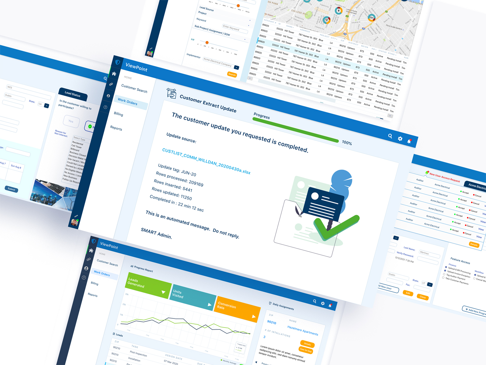
 NEW FORM LAYOUTS
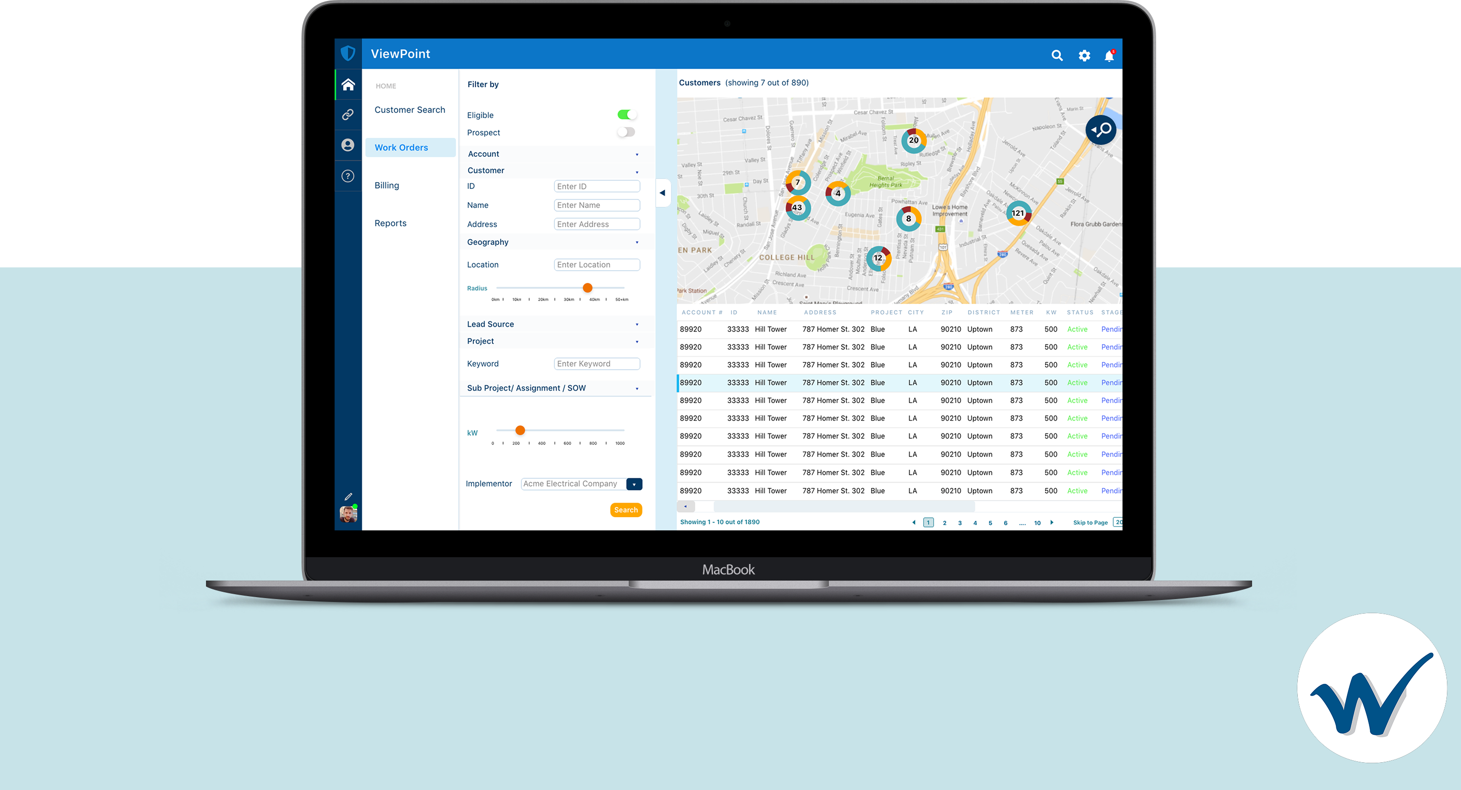
- MAP FEATURE & UI
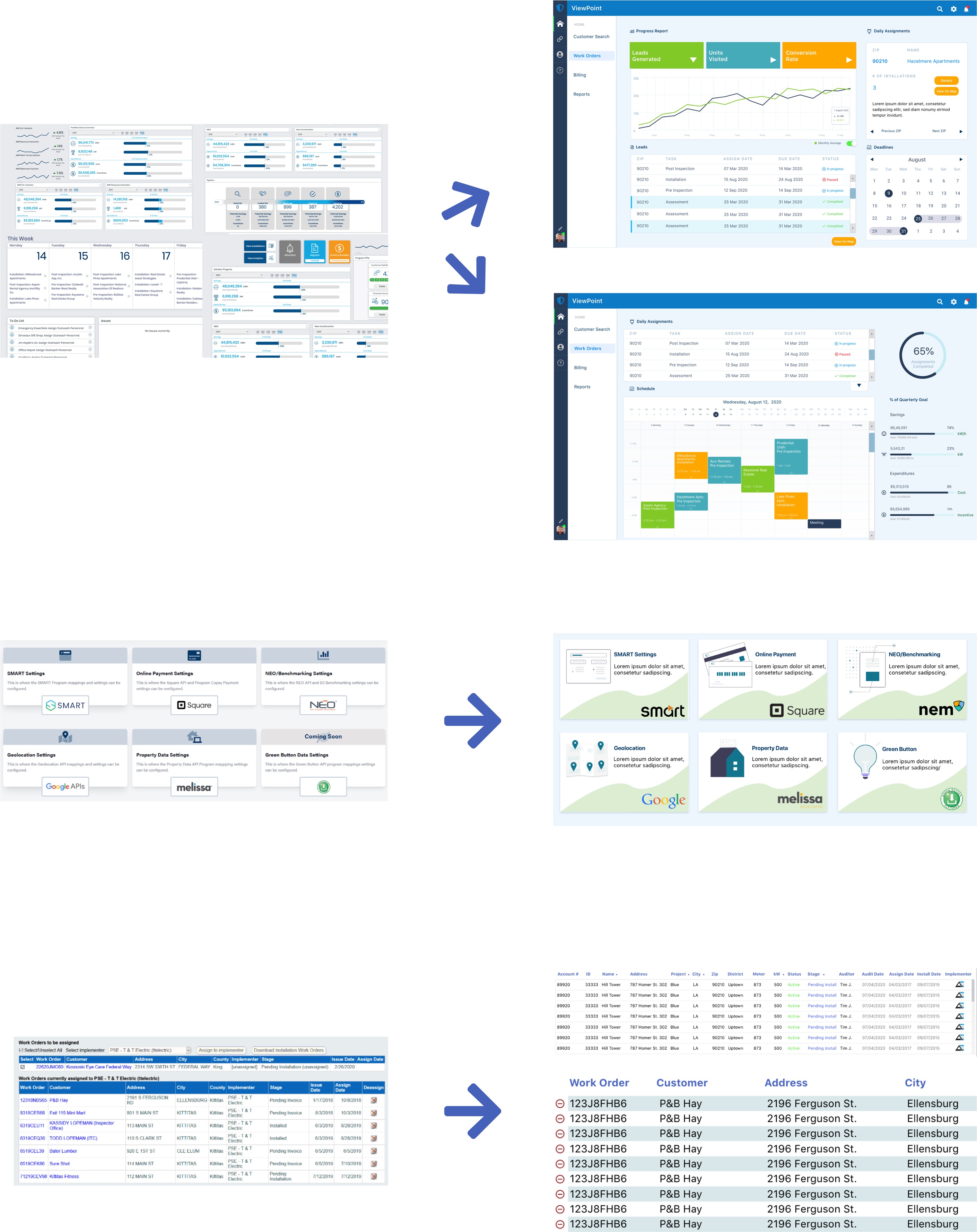
- DASHBOARD ORGANIZATION

- NEW FORM LAYOUTS
- MAP FEATURE & UI
- DASHBOARD ORGANIZATION


 NEW FORM LAYOUTS MAP FEATURE & UI DASHBOARD ORGANIZATION NEW FORM LAYOUTS MAP FEATURE & UI DASHBOARD ORGANIZATION